Key Takeaways
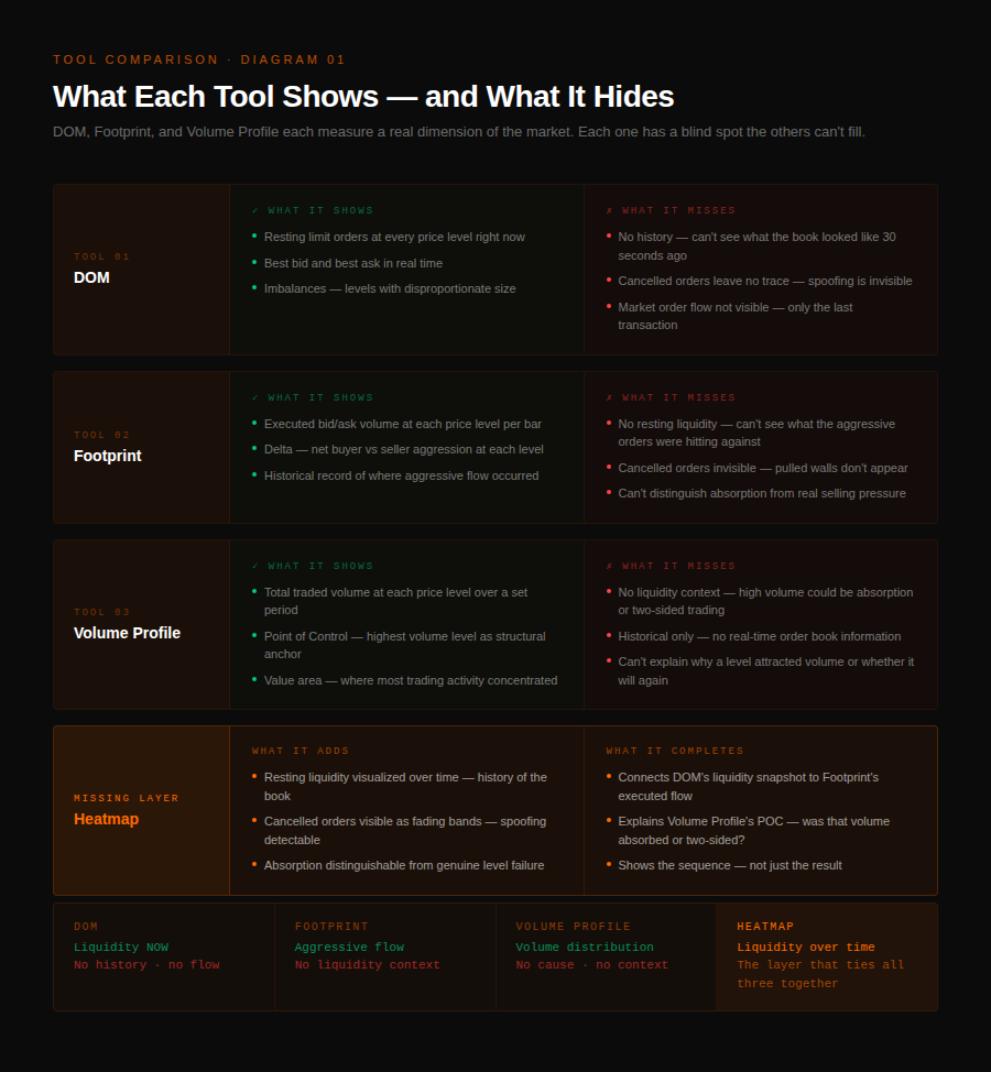
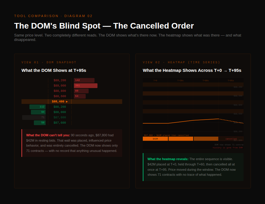
- The DOM shows current resting liquidity but has no memory — a wall that appeared and got pulled is completely invisible on a static snapshot.
- Footprint charts show executed volume at every price level within a bar, but can't show the resting liquidity that aggressive orders are trading into.
- Volume Profile shows where volume happened, but not why — a high-volume node can mean equilibrium or a completed institutional absorption, and those are opposite signals.
- All three tools miss the same fourth dimension: how resting liquidity behaves over time, which is where absorption, spoofing, and genuine institutional interest become visible.
- Combining DOM + footprint + Volume Profile + order-book-over-time on the same setup produces reads that no single tool can support alone.
The Depth of Market ladder, footprint charts, and Volume Profile each show a different dimension of the same market — passive liquidity right now, aggressive flow historically, and volume distribution by price. Each tool is correct within its scope. Each one leaves out something critical that turns clean-looking setups into stop-outs.
QuantFlows is a real-time order flow analytics platform that aggregates heatmap, CVD, and liquidation data across Binance, Bybit, OKX, and Hyperliquid simultaneously.
Every serious futures trader eventually graduates past candlestick charts. You start looking for what explains why price moved, not just that it did. You add tools — a DOM, a footprint, maybe Volume Profile as a framework for where price wants to be.
And then you still get stopped out on what looked like strong support. Or you miss a breakout that had been telegraphing for twenty minutes.
More tools didn't close the gap. They gave you more data — but still not the complete picture.
Understanding what each tool actually measures — and, more critically, what it doesn't — is the prerequisite for building a read that doesn't leave you blind where it matters most.
What Does the DOM Show, and What Does It Miss?
The Depth of Market ladder is the most direct view of the order book available on most platforms. According to Optimus Futures, DOM is a measurement of the supply and demand for a tradeable asset, showing how many open orders and relevant quantities exist at each price. Bids stack on the left, offers on the right, current price in the middle.
The DOM gives you visibility into passive order flow — you can see 38M sitting at 87,800, a thin ask side up to 89,200, gaps in the book between zones. That's genuinely useful. The problem is what the DOM can't show you.
The DOM has no memory. It shows the book as it is right now, with no record of what it was thirty seconds ago. A 42M bid wall that appeared, influenced traders, and got pulled — that entire sequence is invisible on a static snapshot.
The second gap: the DOM shows limit orders only. Market orders — the aggressive flow hitting the book — are invisible except as the most recent transaction. If you're trying to understand whether a level is holding because of genuine two-sided trading or because one large participant is absorbing all the sell flow, the DOM alone can't tell you.
There's also a third blind spot the DOM shares with any raw book view: it can't distinguish visible resting orders from iceberg orders and hidden liquidity — orders that are executing but weren't showing until they filled.
How Do Footprint Charts Read Executed Order Flow?
Footprint charts solve the historical problem the DOM has. Instead of a live snapshot, they build a record of executed volume at each price level over time. According to NinjaTrader, a footprint chart shows the buy and sell volume executed at each individual price level within a bar — unlike a standard candlestick, which only shows open/high/low/close, a footprint reveals who was more aggressive at every price traded during that period.
This is powerful. Footprint charts let you identify aggressive buying or selling at specific levels, spot delta imbalances where one side is dominant, and see where volume is clustering.
Delta — the net difference between ask volume and bid volume across a bar — tells you the direction of order flow pressure, not just where price closed. Per LiteFinance, the key concept behind footprint reading is absorption, where price remains stable despite a strong flow of market orders. That's the pattern that separates a real reversal from a false one.
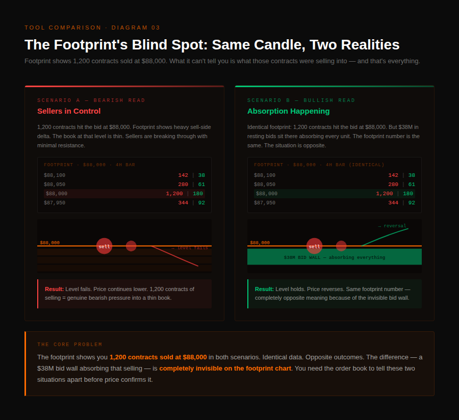
But footprints have a blind spot that's just as serious as the DOM's. Footprint charts show executed orders. They can't show you resting limit orders — the passive liquidity sitting in the book.
This distinction matters enormously, because whether a market sell order is bearish depends entirely on what it's selling into. Imagine 1,200 contracts hit the bid at 88,000 in a single bar. On a footprint chart, that looks like heavy selling.
But if there were 40M in resting bids at that level absorbing every unit of that sell flow without being depleted, the aggressive selling was being absorbed, not succeeding. A reversal is incoming. The footprint showed you the pressure — it couldn't show you the wall the pressure was hitting.
Reading delta alongside CVD helps confirm the sustained direction of pressure across bars, but neither answers the resting-liquidity question.
What Is Volume Profile and Why Isn't It Enough?
Volume Profile takes a different approach entirely. Rather than showing individual bars or live order flow, it aggregates total traded volume across a time period into a histogram by price level.
The Point of Control — the level with the most volume — becomes a structural anchor. Value Area high and low define the range where most trading occurred. Per TradingView's documentation, when a market is balanced, volume distributes evenly across price levels, while an imbalanced state reveals clusters at specific levels — indicating supply/demand disparity and potential price trends.
Volume Profile gives traders a way to identify significant levels without watching the market tick-by-tick. In liquid futures markets, POC levels frequently act as magnets — price often revisits areas of high volume concentration. The theory has observable validity.
But the same structural weakness applies. Volume Profile shows where volume happened. It provides no explanation of why it happened — and that distinction is what separates a level that will hold again from one that won't.
High volume at a level can mean two completely different things. It can mean genuine two-sided interest — real buyers and sellers finding equilibrium. Or it can mean a large participant was absorbing aggressive orders on one side, which won't repeat if they've completed their accumulation.
The second scenario produces a high-volume node that means the exact opposite of what standard Volume Profile theory suggests: the participant who created it is done at that level.
The Missing Layer: How Resting Liquidity Behaves Over Time
Each of these three tools measures a different dimension of the market. The DOM measures resting liquidity in the present.
Footprint measures aggressive flow historically. Volume Profile measures volume distribution historically.
Each one is correct within its scope. Each one is incomplete without the others. What all three miss is the fourth dimension: how resting liquidity behaves over time.
The market's most informative moments aren't snapshots — they're sequences. A large bid wall appears, holds through multiple waves of selling pressure, and price reverses. That's absorption.
A large offer appears above price, lures longs into selling, then disappears before price touches it. That's spoofing — decoy liquidity used as a psychological tool.
A cluster of bids builds gradually at a level over forty minutes, gets tested, and holds — that's genuine institutional interest. The pattern becomes visible only when you can watch the book evolve over time.
This is what a heatmap over time adds. Watching whether an order persists as price approaches, or vanishes just before contact, is one of the clearest tells of whether liquidity was real or bait — a signal you can't get from a static DOM, an executed-volume footprint, or a Volume Profile histogram.
How the Full Picture Changes Real Trades
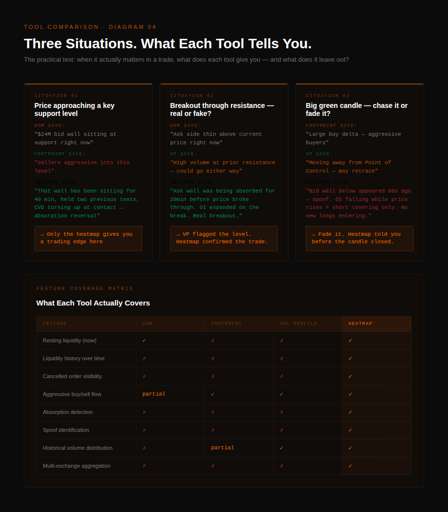
The tools connect around three specific scenarios where the missing layer decides the outcome.
The first is support and resistance. On a price chart, support is a level that held previously.
On a footprint, it's a level with aggressive buying. On Volume Profile, it's a level with high historical concentration. On the order book over time, it's a level where resting bids held through real selling pressure — or it's a level that looks like support but has an empty book underneath it.
Only the last version tells you which scenario you're actually in before you enter.
The second is breakouts. Footprint tells you there was aggressive buying at the breakout. Volume Profile tells you if volume was elevated.
The order book over time tells you whether resting ask-side liquidity was being absorbed going into the break — and whether open interest expanded as the break occurred.
The third is reversals. Footprint can show delta exhaustion at a high — aggressive buying that ran out of follow-through. The order book over time shows whether a large bid wall was holding below price throughout that entire run, absorbing every pullback, and whether it started to thin before the reversal.
Platform-observed pattern: on QuantFlows, the cleanest reversal setups consistently combine all four data layers — DOM depth, footprint delta exhaustion, high-volume node from Volume Profile, and heatmap-visible resting liquidity holding through the test. Any three of the four can be misread on their own. When all four align, the read has structural support no single tool can provide.
The tools aren't wrong. They're incomplete without the layer that connects them.
FAQ
What is the difference between DOM and footprint charts?
The DOM shows resting limit orders currently sitting in the book at each price level, while a footprint chart shows executed trades — how much volume actually traded at the bid versus the ask within each bar over time.
Can you use DOM, footprint, and Volume Profile at the same time?
Yes — each tool measures a different dimension (passive liquidity, aggressive flow, volume distribution), and they're most reliable when confirming the same read together rather than used in isolation.
What does a footprint chart tell you that a candlestick doesn't?
A footprint chart shows bid volume and ask volume at every price level inside each bar, revealing whether buyers or sellers were more aggressive at specific prices — data that a candlestick summarizes into just open/high/low/close.
What is Point of Control in Volume Profile?
The Point of Control (POC) is the price level with the highest traded volume in the profile period, considered the fairest price where the most business was done — and often acts as a magnet that price revisits.
Why do high-volume nodes sometimes fail as support?
Because high volume at a level can mean either two-sided equilibrium or one-sided absorption by a large participant — if it was the second case and that participant is done accumulating, the node has no reason to hold on the next test.
What is absorption on a footprint chart?
Absorption is when price remains stable despite a strong flow of aggressive market orders, indicating that passive resting orders on the opposite side are soaking up the pressure without giving ground — often a signal of an incoming reversal.
Do these tools work in crypto futures?
Yes — DOM, footprint charts, and Volume Profile all work in crypto perps markets, though many traders combine them with a real-time heatmap of the order book to capture the resting-liquidity-over-time dimension that all three tools miss.
Track DOM depth, footprint delta, and resting liquidity over time in the same view across Binance, Bybit, OKX, and Hyperliquid. Free during beta at quantflows.xyz.