You watched BTC break above a key level. You went long. Price reversed immediately, swept your stop, dropped 4%, then launched higher without you. No news catalyst. No obvious reason. The candle closed green eventually — just not with your position in it.
What happened was visible. The information existed in real time. It just wasn't on your chart.
That's the gap order flow analysis closes. Not by predicting where price goes, but by showing you the structural reality underneath each candle — who's hitting the market aggressively, where resting liquidity is stacked, where forced orders are loaded and waiting.
QuantFlows was built to surface exactly this data across Binance, Bybit, OKX, and Hyperliquid simultaneously, because no single exchange tells the full story.
Order Flow Analysis Starts With the Order Book
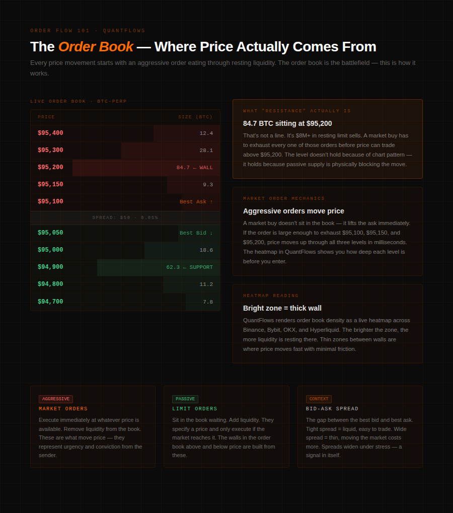
Every price move in a futures market starts with an order. Specifically, it starts with an aggressive order — a market buy or market sell that removes liquidity from the book instead of adding it.
The order book at any moment is two stacks of resting limit orders: bids below the current price (passive buyers willing to buy if price drops to them) and asks above it (passive sellers willing to sell if price rises to them). The distance between the best bid and best ask is the spread. The volume stacked at each price level represents real money waiting to transact.
When a market order hits the book, it eats through that resting liquidity. A market buy lifts the ask. A large enough market buy eats multiple ask levels, moving price up. If the resting ask stack at a level is deep — say $80M in limit sells sitting at $95,000 — a market buy has to exhaust that $80M before price can move above it. That's what a resistance level actually is: concentrated passive supply that aggressive buyers haven't yet defeated.
QuantFlows renders this in real time as a heatmap. The brightness of each zone reflects the concentration of resting limit orders at that price. Bright orange clusters are walls of liquidity. Thin zones are where price moves fast with little friction.
CVD: The Scoreboard of Aggression
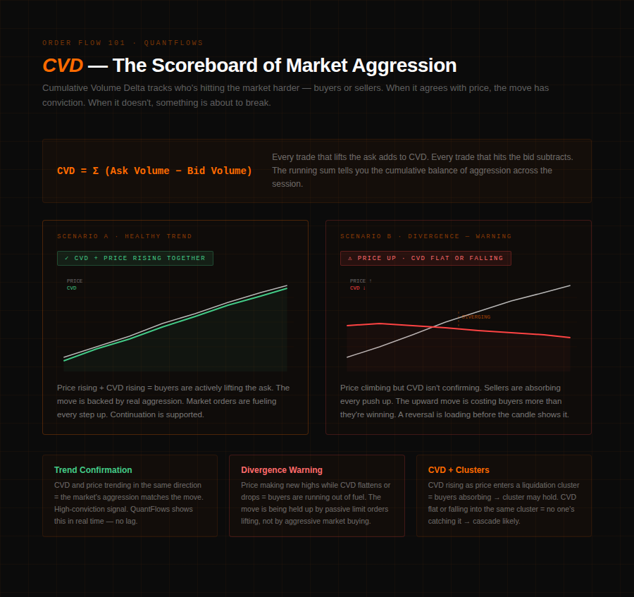
Watching the order book alone gives you a snapshot — where liquidity is right now. Cumulative Volume Delta (CVD) gives you the running score of who's winning the fight.
CVD is calculated by subtracting sell-side volume (trades that hit the bid) from buy-side volume (trades that lifted the ask), and summing that difference continuously. When buyers are aggressive — sending market orders that lift the ask — CVD rises. When sellers are aggressive — hitting the bid — CVD falls. The result is a line that tracks the cumulative balance of aggression across any period you choose.
Two reads matter most. First, trend alignment: CVD rising alongside price means the move is backed by real aggressive buying. That's a healthy, conviction-backed trend. CVD falling while price rises is a warning sign — price is moving up but not because buyers are attacking. Passive limit orders above the market may be pulling rather than being lifted through.
Second, and more powerful: divergence. Price makes a new high but CVD doesn't. That's a structural signal that the buying pressure fueling the move is fading. Sellers are absorbing. The move is losing engine even if the candle hasn't shown it yet. QuantFlows displays CVD as a live line alongside the heatmap and price, so divergence reads are immediate rather than retrospective.
Liquidation Clusters: Where Forced Orders Are Loaded
Order flow analysis in crypto futures has a layer traditional markets don't: liquidation clusters. These are zones where leveraged positions — longs or shorts — will be force-closed by exchange engines if price reaches them. They're not resting limit orders placed by traders making decisions. They're forced market orders that will print automatically, regardless of context or intent.
Because open interest data is partially public across Binance, Bybit, OKX, and Hyperliquid, it's possible to estimate where these clusters sit. QuantFlows aggregates this across all four exchanges and displays the resulting density map as a live overlay. Bright zones below current price are dense long liquidation clusters — forced sells waiting to trigger. Bright zones above are short liquidation clusters — forced buys.
The interaction between clusters and CVD is where the real read lives. When price approaches a large long liquidation zone, watch CVD for confirmation: if CVD is trending up as price approaches the cluster, limit buyers are absorbing the approaching sell pressure — the cluster may act as a floor.
If CVD is neutral or falling as price enters the zone, no one's catching it, and the cascade is likely to run. That read alone changes how you trade a "support" level — it's no longer just a line on a chart, it's a live assessment of whether the floor has buyers underneath it or not.
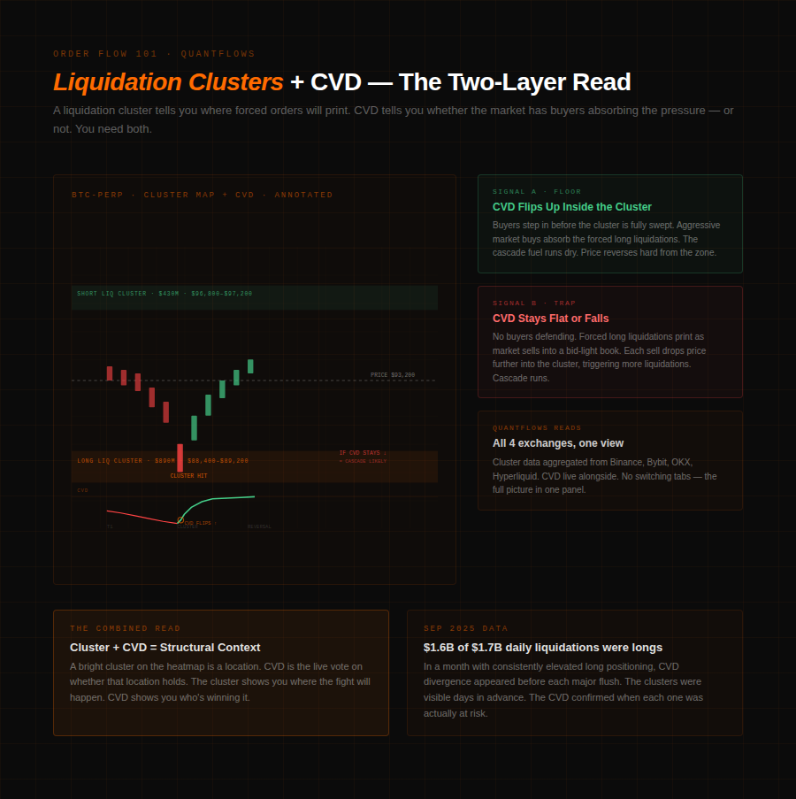
In September 2025, $1.6 billion of the $1.7 billion in daily crypto liquidations came from long positions in a single month. The clusters generating those liquidations were visible on a heatmap for days before price arrived.
Bubble Market Dots: Spotting the Large Trades
The fourth layer QuantFlows surfaces is Bubble Market Dots — a real-time visualization of unusually large individual trades executing in the market. When a $5M market buy hits the BTC perp on Binance, that's not retail noise. It's a signal worth isolating.
Large trades matter because they often represent institutions or well-capitalized traders executing with intention. A cluster of large market buys printing at a level while price stalls shows you absorption — an entity with size is buying everything the seller is bringing. That behavior, visible as expanding bubbles on the chart, precedes breakouts from consolidation zones more reliably than any pattern drawn from price alone.
Bubble Market Dots in QuantFlows are color-coded and sized by notional value. A sequence of large orange dots printing on the bid side while CVD drops and price grinds lower is distribution — someone with size is selling into attempts to hold price up. The same sequence printing on the ask side while CVD rises is accumulation.
When All Four Signals Align
The full picture QuantFlows gives you is the combination: heatmap showing where liquidity is stacked, CVD showing who's aggressive and whether conviction is building or fading, liquidation clusters showing where forced orders are loaded, and Bubble Market Dots showing where large players are transacting.
No single layer is enough. A bright heatmap level can be a magnet — or it can be a spoof, placed to create the appearance of support before being pulled. CVD rising can reflect genuine accumulation or limit-taking, where sophisticated participants refresh limit buys rapidly to drive price without showing up as aggressive market orders. Liquidation clusters are probability zones, not certainties — 75 to 85% of futures volume is captured from Binance, Bybit, OKX, and Hyperliquid, but the remainder is invisible.
Used together, the four layers reduce the number of reads you're guessing at. A trade setup where the heatmap shows a dense bid cluster, CVD is trending up into the level, no large liquidation zone sits just below, and Bubble Market Dots show large buys printing — that's a structurally clean long with multiple confirming signals. The candle alone never showed you any of that.
QuantFlows aggregates all four of these data streams across Binance, Bybit, OKX, and Hyperliquid in one dashboard — live, free during beta. Start reading the market that's actually happening at quantflows.xyz.